Salesboard Dash App for E-com Global
This research project was implemented using Dash.
The project represents a sales dashboard for the E-com Global, specialized in selling various categories of goods worldwide. The interactive Dash app is available here. The code can be seen here.
The first graph analyses total sales by country in 2011. Australia emerged as E-com Global's top customer, driving total sales volume surpassing $6,000, constituting a substantial 29% of the company's overall sales.
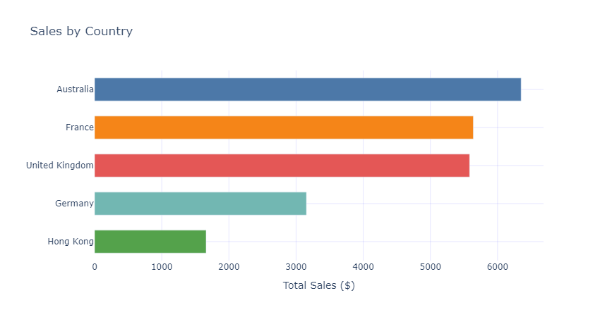
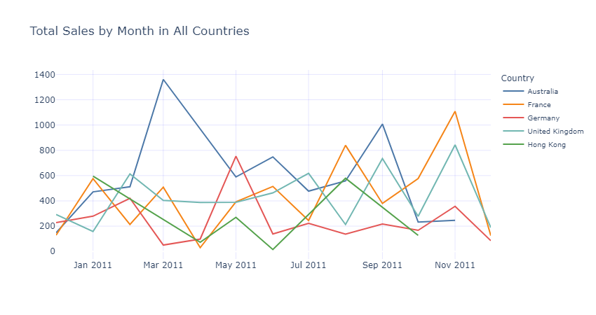
The second graph analyses total sales by month of 2011 for each country. As the graph shows, customer-countries experience sales peaks at different times of the year. The UK and France typically see their highest sales towards the end of the year, during the holiday season. In contrast, Germany and Australia enjoy sales peaks in the spring months, specifically in May and March, respectively. Meanwhile, Hong Kong stands out with two sales peaks annually, occurring in January and late summer.
The third and fourth graphs explore the analysis of preferred goods categories across different countries. The third graph displays customers' preferences in major categories, while the fourth graph focuses on minor categories. To see the results for a specific country and category of goods please use two dropdowns on the interactive Dash app. The analysis revealed that different countries exhibit preferences for various categories of goods. Understanding these preferences enables more targeted and efficient marketing campaigns, and potentially optimization of stock and delivery processes.
You may check the interactive Dash app following the link below.
P.S. Please, give the page enough time to load (about 50 seconds).